Evolution of Windows 1.0 Part 2: The announcement build
Thursday, November 9 2017, 16:52 Windows 1.0 Permalink
On November 10th, 1983, Microsoft officially announced Windows in New York. The initial release date was scheduled for April 1984. In hindsight, this was obviously far too optimistic and probably also part of Microsoft's strategy to secure early endorsement by OEMs and ISVs as well as limiting their growing competition in the GUI market. As part of the announcement, a pre-release version was briefly demonstrated to the attendees, and luckily, some people took photos of it, which we'll analyze below.
There are actually two photos of this build: one from an unknown source and one published in February 1984 issue of Personal Computing magazine. They were likely taken just minutes apart and together they give us plenty of things to discuss.
The first photo
Chronologically, the photo from an unknown source was made first. It was added to the Windows 1.0 Fall COMDEX build article on BetaWiki by a member, but at the time of writing this post I still haven't received a reply to my requests for the original source. It actually predates the Comdex 1983 demonstration, which was held roughly two weeks later, so it was added to the wrong article anyway (as were several other photos of such early builds).
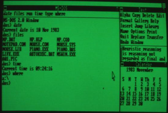
The first thing you'll notice is that the UI has been completely overhauled since the Interface Manager demo earlier in the year. The command bar at the bottom is gone - it was replaced by a menu-driven approach. Each applications now carries its own menu bar just below the title bar. A system status bar of sorts was added to the top of the screen, with a single button on the right. This can be seen in action in the second photo, so look below for more information on that. The button on the left side of each application's title bar is used for minimizing the application into the icon area at the bottom of the screen. The button on the right is a help button, as the question mark on it obviously suggests. You may also notice that the resize box at the bottom right of a window is now gone. Its purpose has been voided, as windows can now only be tiled to a specific size (depending on the number of windows that are open and their position on the screen), instead of being able to overlap as well as be moved around and resized freely. It's still not clear why exactly were overlapping windows removed so early in development, though possible reasons include performance considerations, fear of facing a lawsuit from Apple due to simmilsimilaritye Macintosh UI, and the official reason as stated by Microsoft - to make the best use of the screen space at all times. Needless to say, this major UI overhaul probably delayed the project significantly, and it would take Microsoft over a year to completely finalize the UI design in mid-1985. Another minor detail is the mouse cursor - it's now white, and it's remained that way ever since.
Now let's analyze the open applications. We can see three apps are running - they are called "MS-DOS", "Text" and "Calendar". MS-DOS is actually an early version of MS-DOS Executive from the final release, as unlikely as that may seem now. But don't worry, you'll see how it connects in the future when we get to see the actual evolution of this particular application. At this point, however, MS-DOS Executive is not a graphical file manager, but rather a simple command prompt window. But don't let the looks fool you, this isn't COMMAND.COM from DOS running under Windows - this is an actual Windows application, designed to look and act like COMMAND.COM. Probably to give users some sense of familiarity with the new system. We can see it has its own menu bar, like all Windows applications from now on, with items named "date", "files", "run", "time", "type", and "where". As you'll see in the Comdex demo, clicking on these performs certain actions in the command prompt. Date displays system date, files lists the contents of the current directory, time displays system time, type outputs file contents to the screen and where prints the current working directory. Some of these are obviously aliases for, while others pretty much are, MS-DOS commands. I'm only not sure how the run command would work in DOS, since executables and batch files are started by typing their name directly. This menu bar will also play a big role in future posts, so keep an eye out for it in my upcoming posts.
If we turn our attention in the output of the prompt itself, we see it first identifies itself as "MS-DOS 2.0 Window". Note that the latest version of MS-DOS at the time was indeed 2.x, support for 3.x came later as Windows development dragged on and on. An interesting choice was made for the famous > prompt - instead of the usual drive letter, a colon and a greater-than sign used by proper MS-DOS, this window simply prints out dos>. The first command that was used was date, which as described above, prints out the system date. This is revealed to be 10th November 1983, the day when the announcement was made. Next, the files command displayed all the files in the current directory. 13 files are listed, so let's go over them to try to figure out what they were for:
- MP.DAT, MP.COD, MP.HLP: Microsoft Multiplan for DOS.
- NOTEPAD.COM: a DOS version of Notepad, similar to Word for DOS, included with Microsoft Mouse.
- MOUSE.COM, MOUSE.SYS, MOUSE.LIB: Microsoft Mouse driver for MS-DOS. Windows was still lacking its own drivers at this point and had to rely on MS-DOS.
- PIANO.EXE: the same Piano demo application included with Microsoft Mouse, which we've seen in the Interface Manager demo as an example of an uncooperative DOS application.
- PIANO.BAS: source code for the Piano application in Microsoft BASIC
- LIFE.EXE: another demo app which came with Microsoft Mouse.
- AUTOEXEC.BAT: we all know what this file does. In this case, it was likely made so that the demo version automatically starts up some applications, like the ones we see in the photos.
- MSWIN.EXE: probably the kernel itself, at this point still in a single file due to the system's rather primitive state.
- A01.PIC: a demo image that was later often showcased in the early version of Microsoft Paintbrush, which we can see running in the second photo.
Keep in mind that at this point, Windows likely didn't support hard drives yet (the original system requirement for storage was two floppy drives), so everything runs off of floppy disks. There may be more apps on additional disks that we sadly don't get to see in this case. The last two command issued before this photo was taken were time and where. The latter confirms this build is indeed running off of a floppy disk in drive A:.
The MS-DOS window takes up two thirds of horizontal screen space, with the remaining third being vertically split between Text and Calendar. Text is really just a proto-Notepad of sorts. You probably immediately noticed it's big and cumbersome menu bar. It reminds me of the command bar in Interface Manager, so I can imagine it was simply adapted from that. Notepad wasn't the only app to have such a terrible menu, and it took quite a while before the developers got the menus right. As for the contents of the Text window, we can see an excerpt from a mathematical book How to Solve It: A New Aspect of Mathematical Method (by G. Polya) about heuristic reasoning. Notice the tiny vertical scrollbar for the content on the left.
Below Text is the Calendar application, which was a simple date picker at this point (and remained so until mid-1985, when it was turned into a more proper calendar application, but more on that once we get there).
Photo from Personal Computing 1984-02
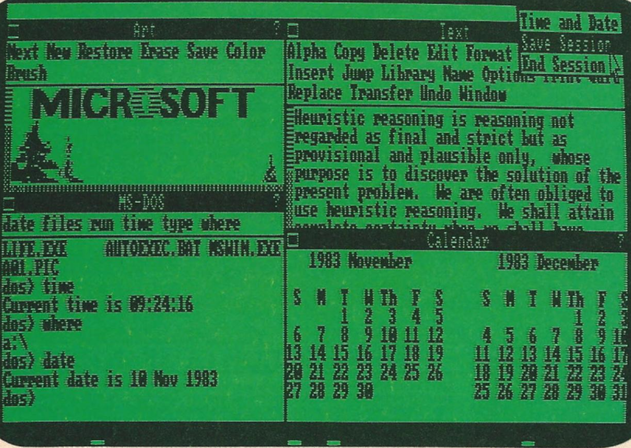
In this photo, we can see the very top of applications icon at the bottom, but unfortunately not enough to be of much use. The screen is now split roughly in half and is shared with a fourth application in the top left quarter, "Art". This is an early version of Microsoft PainbrPaintbrushtioned above, and in this case, it is likely showing us that A01.PIC file we've seen listed in the MS-DOS window. The image itself was a simple demo image made by Microsoft, featuring their logo (naturally) and what appear to be some spruces, though the latter can barely be seen in this case due to small window height. We also get to see a horizontal scrollbar for the first time.
As far as the MS-DOS window goes, the only difference is that the date command was ran again, giving us an additional proof that this was in fact taken at the same event as the previous photo. The Text window reveals nothing new, while the Calendar now shows the month of December 1983 as well. Notice that it lacks scrollbars throughout the demo, so I'm not sure how navigation was performed - perhaps with the keyboard?
The last thing worth pointing out is that the button in the status bar has been clicked, revealing a 3-item menu, consisting of "Time and date", "Save session" and "End session". Time and date displays system time and date on the left side of the status bar (this is demonstrated during Comdex), while the other two options were likely carried over from the command bar in Interface Manager and allow you to get out of Windows and return to MS-DOS. End session seems obvious enough, but I'm not sure how Save session worked (provided it worked at all) - did you first have to click Save session to save your open applications and then End session to actually leave Windows, or does Save session do both of these? I guess we'll never find out, as this feature is not described thoroughly anywhere (at least as far as I know), and it was removed, along with the status bar, by November 1984 at latest (DR5 and one Tandy 2000 demo build from that time period no longer have it). If my memory serves me right, this feature only returned with Windows 3.0 in 1990 in the form of a checkbox in the quit dialog.
Conclusion
If we consider what was said in part 1 follow-up about Windows being in development since late 1981, we now suddenly realize Microsoft threw away most of that work and decided to make the UI more Macintosh-like, with menu bars, icons, etc. While this was obviously a good choice from users' point of view (for the most part, excpe exceptiling windows in my opinion), it no doubt prolonged development - something that would happen again several times as the UI and core elements of the system were being redesigned and redefined far too often. I should also mention that while this build was demonstrated on 10th November 1983, it's actually older than that. How much older? Impossible to tell, really, since we don't even know when was the UI overhauled. As you'll see in later posts, I actually think that there are also simmilsimilarolder builds than this one.
There was one more demonstration of these early builds before Comdex, made for InfoWorld staff on 14th November 1983 at Microsoft's offices, so stay tuned for the next part to find out more about it.